There’s only one thing you need to know in order to develop a strong visual theme on Instagram. Before I tell you what it is, I want to paint a picture for you:
Imagine you’ve been asked to paint a room for a friend (I know. Cruel and unusual punishment!). You decide to go with the color white. Now imagine you’re painting the walls and then halfway through, you switch over to a lime green color. Not only that, but you also start hanging up polka-dotted wallpaper to certain areas, just to spice things up a bit. Sounds like an eyesore, right? Yea, it is!
That is exactly what happens on Instagram when you don’t stick to a theme. Your page looks like a lime-green, polka-dotted catastrophe! That is why it’s so important to not only pick a theme but to also keep *clap* things *clap* consistent*! Visual consistency is the biggest thing that separates great accounts from not-so-great accounts. I’ll say it again:
Visual consistency is the biggest thing that separates great accounts from not-so-great accounts.
What exactly does visual consistency mean? It essentially means keeping certain elements of your photos the same, each and every time. In other words, creating a theme. For example, there are some people on Instagram who use the exact same filter or editing process on all of their photos. This helps to create a consistent aesthetic, regardless of what’s being photographed. Using filters is probably the easiest way to achieve visual consistency, but there are still countless other ways (e.g. color theme, minimalist theme, white theme, etc.). The options are limitless!
If you’re still a bit unclear on how this works, here are a few examples of accounts that I think have totally nailed it!
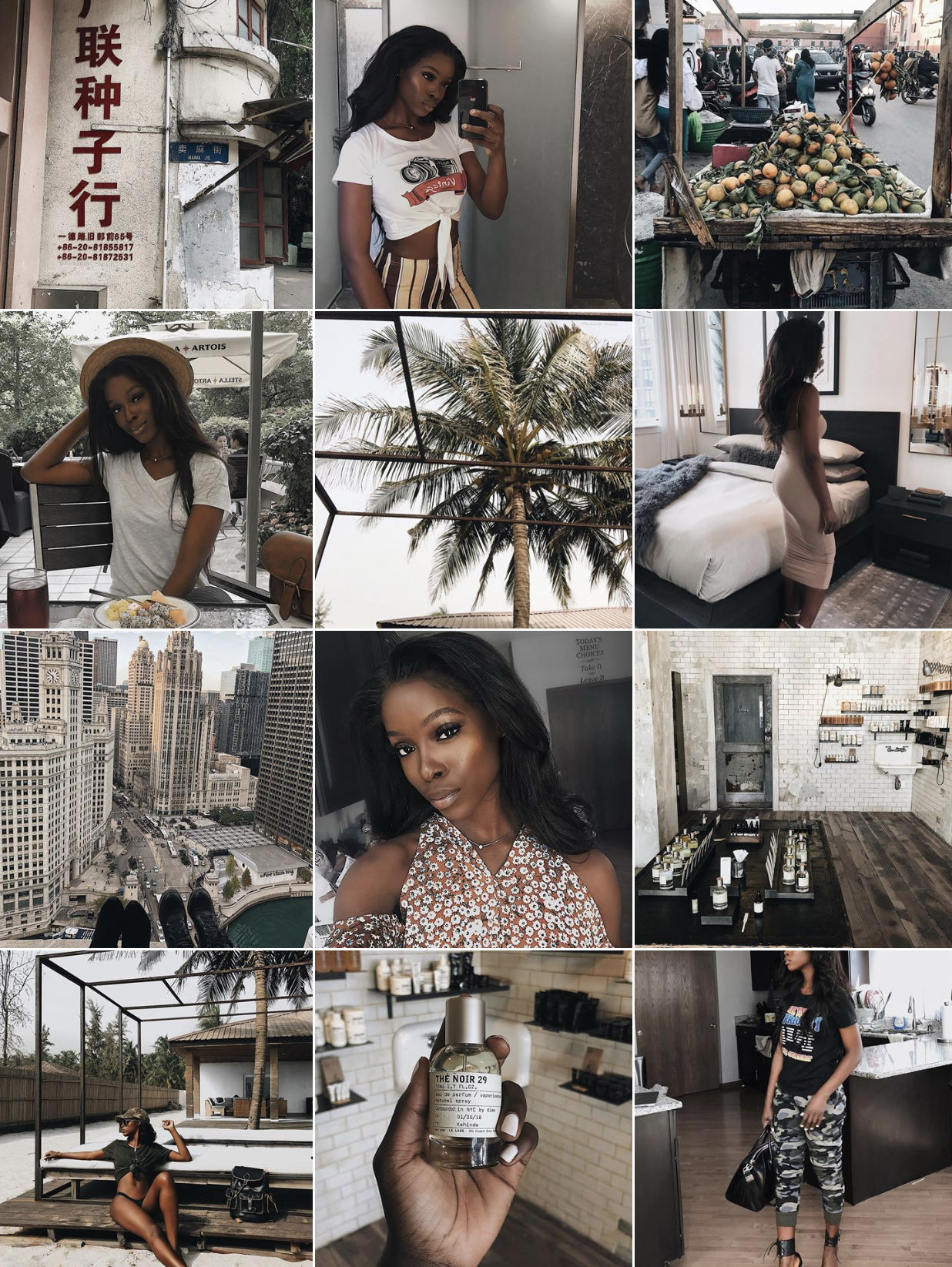
@Asiyami_Gold

Asiyami is the king AND queen of visual consistency. She has the type of feed that makes you feel as though you’re right there with her living a life of understated luxury. Yes, she’s an amazing photographer. Yes, she’s a great Creative Director. However, the thing that really brings her page together is that she keeps *clap* it *clap* consistent! From the type of content that she posts (food, travel locations, etc.), the colors that she uses and the way that she edits her photos, everything is CONSISTENT. And it pays off in a major way for her. It also doesn’t hurt that she’s frigging stunning! Seriously, I just want to be a fly on the walls of her life.
@Kehinde_Smith
Kehinde is another influencer who has established a visual identity that is both strong and consistent. She uses a lot of dark browns, greens and blacks in her photos and it appears as though she desaturates her images and increases the contrast to give her photos a unique look and feel. All of this helps to bring her images together in a way that is cohesive and visually appealing. Imagine seeing a bright red photo on her account. It would stick out like a sore thumb.
@Authentically.B
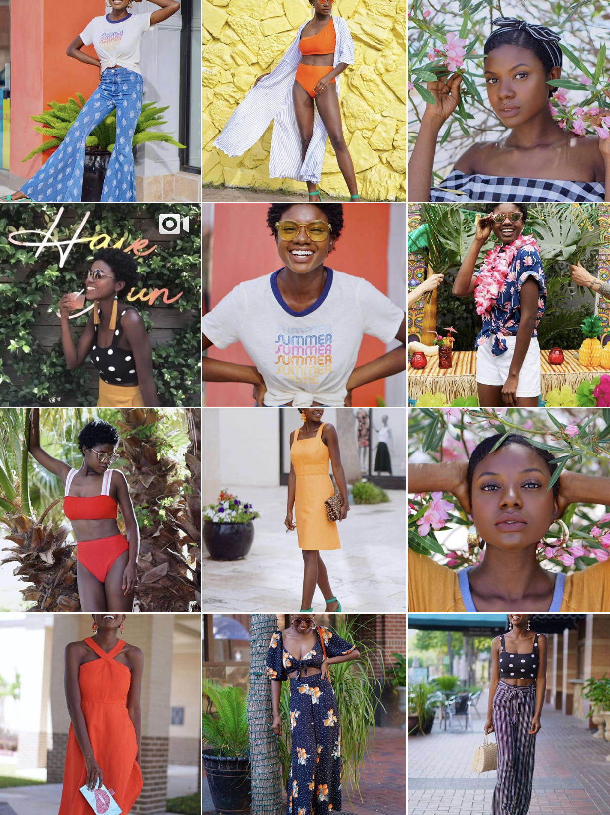
The first time I saw Brandy’s page, I instantly fell in love. Her theme incorporates beautiful bursts of vibrant colors. If you scroll down her feed you’ll see a lot of reds, yellows, blues and other eye-catching hues. Because she has such a colorful theme, you’d probably rarely ever see a white photo on her feed as it would throw off the cohesiveness of her page.
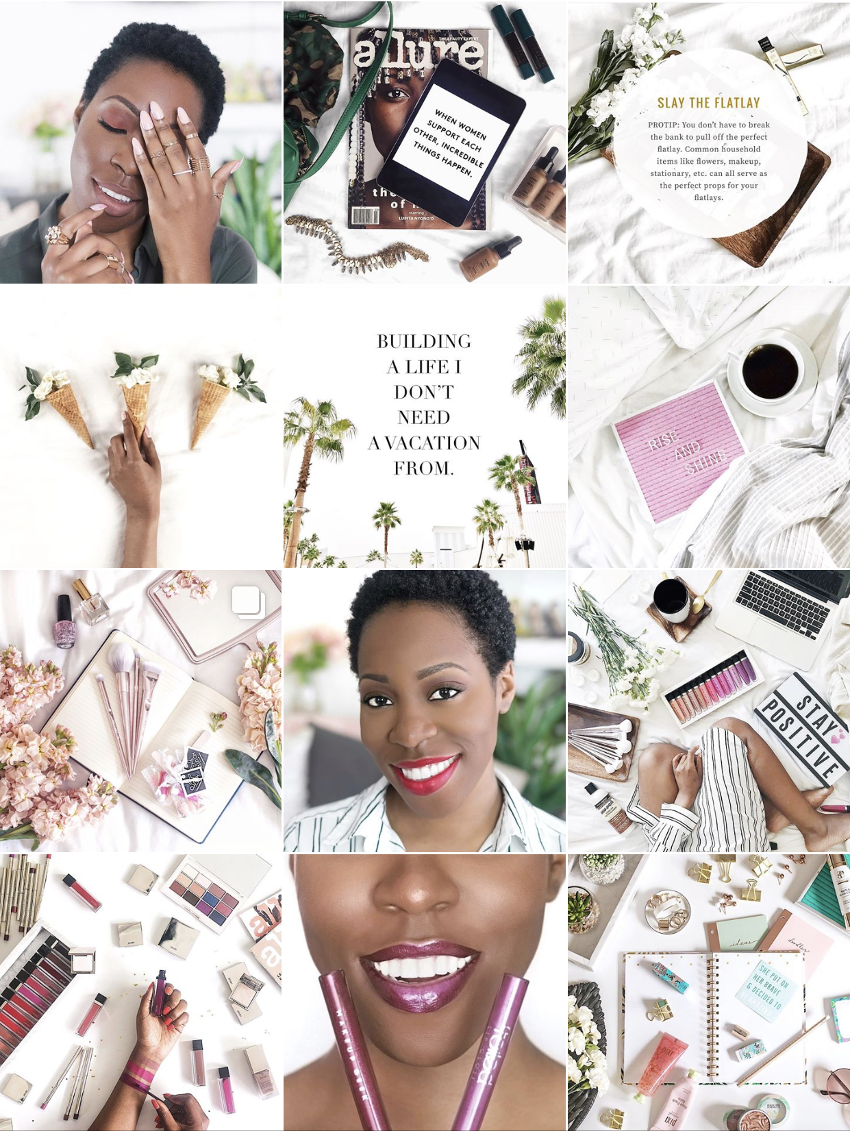
@PiecesofOnye
Now ya know I had to throw my own account into the mix! For my own Instagram account, I went with a white theme. It’s my bread and butter and so I stick to it! EVERY post on my page has a white backdrop. Every. Single. Post. I’m currently trying to further flesh out my theme by limiting prop colors to white, green, black and brown, with sprinkles of pink. You’ll rarely see me venture outside of these colors because I likes to keeps it consistent.
Takeaways
So what can we take away from these beautiful Instagram accounts? Consistency is key. Whatever direction you decide to take your Instagram, you have to stay the course if you want your page to look consistent. If you want a pink theme, simply ensure that you’re using that color on your feed, consistently. It does not necessarily have to be present in EVERY photo. However, you want it to appear enough times for it to look intentional and not accidental. If you decide to use filters, pick the one that you like and try to use it, or something similar, for all of your photos. Trust me, taking this step will pay off in the long run!
Let’s collectively put a death to the lime-green, polka-dotted Instagram accounts.
Want More?
Join the PIX Tips Facebook Group to learn more about photography and to grow with other photographers of color and Subscribe to my email list!. And if there’s a topic you’d like for me to cover next, drop a comment down below!